
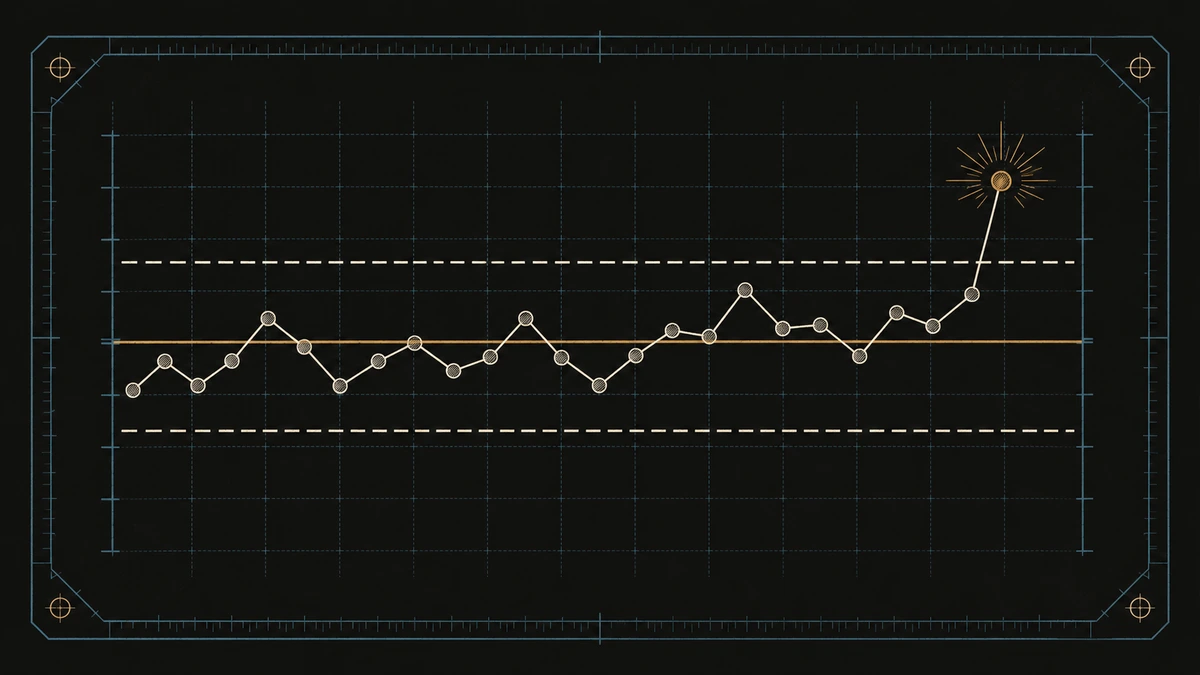
A part can measure dead-on to the print and still come off a process that’s quietly falling apart. Final inspection won’t tell you that. It sorts good parts from bad, one at a time, after you’ve already spent the money to make them. Statistical process control charts work the other way around: they watch the process itself, in time order, and warn you when something has changed while you can still do something about it.
That shift, from judging parts to judging the process, is what Walter Shewhart sketched on a single sheet of paper at Bell Labs in 1924. A century on, the control chart is still the most direct way to see whether a process is stable, and it sits at the center of Six Sigma, ISO quality systems, and most continuous-improvement work on the floor.
This guide covers what these charts are, the main chart types and the data each one fits, how to read the control limits and the out-of-control signals, and how to build one from your own numbers.
Direct answer — What is a statistical process control (SPC) chart?
A statistical process control (SPC) chart is a time-ordered graph of a process measurement with three reference lines: a center line at the process average, plus upper and lower control limits set three standard deviations above and below it. Points inside the limits with no unusual pattern show common-cause variation; points outside the limits, or non-random patterns, signal a special cause worth investigating. Control limits come from the process itself, not from customer specifications.
Key Takeaways
- An SPC chart separates common-cause variation (the normal noise of a stable process) from special-cause variation (a real, findable change).
- Every chart has three lines: a center line at the average, and control limits at roughly ±3σ, where about 99.73% of points from a stable process fall.
- Pick the chart by your data: X-bar & R or I-MR for measured (variables) data; p, np, c, or u for counted (attribute) data.
- Control limits are the voice of the process. Specification limits are the voice of the customer. They aren’t the same lines, and confusing them is the most common SPC mistake.
- A point outside the limits, or a run or trend inside them, is a signal to investigate, not proof a part is bad.
What is statistical process control (SPC)?
Statistical process control (SPC) is a method of monitoring a process with data plotted in time order, using control charts to separate routine common-cause variation from special-cause variation that points to a real problem. Shewhart’s insight was that every process varies, and that reacting to normal variation as if it were a fault (tampering) makes output worse.
He split variation into two kinds. Common-cause variation is the natural, repeating noise built into a stable process: small swings in material, ambient temperature, or operator technique that you can’t trace to one event. Special-cause variation, also called assignable-cause, is different: a tool chips, a new lot of material arrives, a setting drifts. It has a specific, findable source.
W. Edwards Deming carried this thinking into postwar manufacturing and made it the spine of modern quality practice. The whole job of an SPC chart is to answer one question honestly: is what I’m seeing right now just common-cause noise, or a special cause I should chase? SPC is also one of the core Six Sigma tools, the statistical engine behind the Control phase of DMAIC, where the point is to hold a hard-won improvement in place instead of letting it slide back.
How to read a statistical process control chart
To read a control chart, start with its three lines. The center line (CL) is the process average over the baseline period. The upper control limit (UCL) and lower control limit (LCL) sit above and below it, drawn (for most Shewhart charts) at three standard deviations from the center.
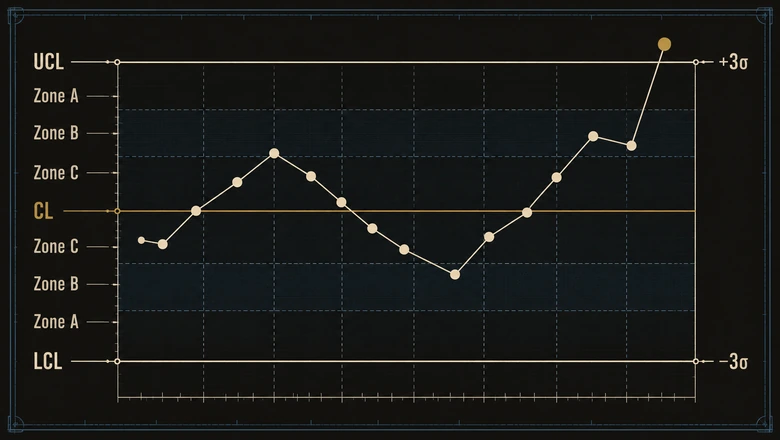
UCL, LCL = Center Line ± (3 × σ)Three sigma isn’t arbitrary. For a stable process whose output is roughly normal, about 99.73% of points land within ±3σ of the average, so a point beyond a limit is rare enough (about 3 in 1,000 by chance) that it’s worth treating as a signal rather than luck. The ±3σ convention traces back to Shewhart’s original work and is codified in the NIST/SEMATECH e-Handbook and every major SPC standard.
In practice you rarely compute σ directly. For an X-bar and R chart you estimate it from the average range of your subgroups, using a published control-chart constant:
UCL, LCL = X̄ ± (A₂ × R̄)Here X̄ is the grand average of all the subgroup means, R̄ is the average subgroup range, and A₂ is a constant that depends only on subgroup size (for a subgroup of five, A₂ = 0.577). Sister constants D₃ and D₄ set the limits on the companion range chart. Any SPC tool or a decent template applies these for you; what matters is knowing the limits are calculated from your own data, not typed in by hand.
Control limits are not specification limits
This is the distinction that trips up most people new to control charts, and it’s worth getting right before you plot anything.
IMPORTANT
Control limits are not specification limits. Control limits come from the process (the voice of the process) and describe what it actually does; specification limits come from the customer or the drawing (the voice of the customer) and describe what you need it to do. A process can sit inside its control limits and still miss spec, so never calculate one from the other or draw them on the same axis as if they mean the same thing.
The types of statistical process control charts, and when to use each
There are many control charts, but choosing one comes down to a single question: what kind of data do you have? Variables data is measured on a continuous scale, like a diameter in millimeters, a fill weight in grams, or a temperature. Attribute data is counted: pass or fail, number of defects, share of rejects. Measured data gets a variables chart; counted data gets an attribute chart.
| Control chart | Data type | Use it for |
|---|---|---|
| X-bar & R | Variables, small subgroups (2–9) | The average and spread of a measured feature, e.g. shaft diameter sampled five at a time |
| X-bar & S | Variables, larger subgroups (10+) | Same job as X-bar & R when subgroups are big enough to use standard deviation instead of range |
| I-MR (individuals & moving range) | Variables, one reading at a time | Slow or batch processes where subgrouping isn’t practical, e.g. a daily viscosity or a per-batch assay |
| p chart | Attribute, proportion defective, varying sample size | Share of nonconforming units, e.g. percent of boards failing test each shift |
| np chart | Attribute, count defective, constant sample size | Number of nonconforming units in a fixed-size sample |
| c chart | Attribute, count of defects, constant sample size | Defects per unit when the inspection unit is constant, e.g. solder flaws per panel |
| u chart | Attribute, defects per unit, varying sample size | Defects per unit when the area or size inspected changes, e.g. flaws per square meter of coil |
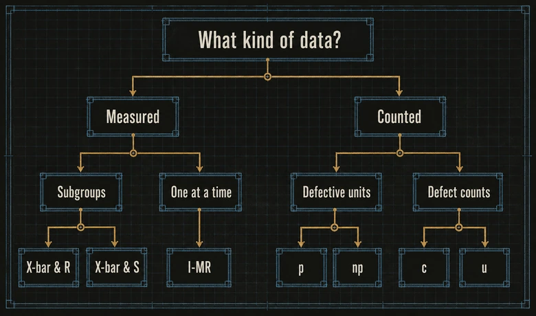
Which chart should you use?
The decision fits in four lines:
- Measuring something on a scale, sampled in small groups? Use X-bar & R (or X-bar & S for bigger subgroups).
- Measuring, but you only get one reading at a time? Use I-MR.
- Counting defective units against a yes/no check? Use p for varying sample size, np for constant.
- Counting defects, where one unit can carry several? Use u for varying opportunity, c for constant.
The chart is only as good as the data feeding it. On a modern line, much of that stream comes straight off machines and gauges through a manufacturing execution system, which timestamps each reading and keeps the subgroups honest; the layer that captures shop-floor data in real time is often what makes continuous SPC practical rather than a clipboard exercise nobody keeps up.
Out-of-control signals: the Western Electric and Nelson rules
A point outside the control limits is the most obvious signal, but it isn’t the only one. A stable process produces a random scatter around the center line; when the pattern stops looking random, something has changed even if no single point has crossed a limit. Two published rule sets turn “looks non-random” into specific, testable conditions.
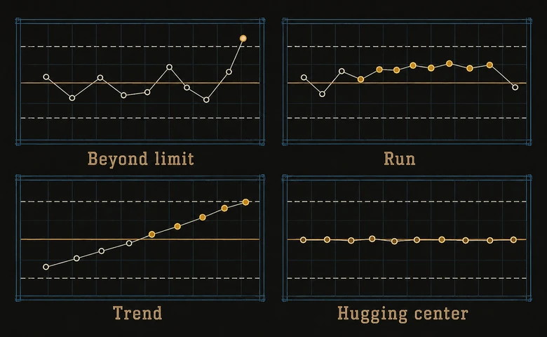
The Western Electric rules, published in the company’s 1956 Statistical Quality Control Handbook, defined the first four tests. Dr. Lloyd S. Nelson extended them to eight in a 1984 Journal of Quality Technology article, tuning each so a false alarm is about equally likely across tests. The eight Nelson rules are the set most SPC software applies today. The common signals:
- One point beyond 3σ (outside a control limit).
- Nine points in a row on the same side of the center line.
- Six points in a row steadily rising or falling (a trend).
- Fourteen points in a row alternating up and down.
- Two of three points beyond 2σ on the same side.
- Four of five points beyond 1σ on the same side.
- Fifteen points in a row within 1σ of the center (hugging the middle, often too good to be true).
- Eight points in a row beyond 1σ on both sides, with none near the center.
This answers the common question about the “7 rules” or “8 rules” of an SPC chart: they’re these tests for special causes, and the exact count depends on whether you use the Western Electric four or the Nelson eight. The zone-based tests rely on dividing each half of the chart into three bands, or zones, labeled A, B, and C outward from the center line.
PRO TIP
Don’t run all eight rules on every chart by default. The more tests you apply, the more false alarms you get on a genuinely stable process. Most shops start with the beyond-limit rule plus the run and trend tests, then add zone rules only where catching small shifts early is worth the extra investigation.
From signal to fix
A signal is where SPC hands off to the rest of your quality system. Once a special cause is confirmed, the response lives in your corrective-action process, and the system that logs the nonconformance and tracks the fix to closure is what keeps one signal from becoming a repeat next month.
More often than not, the special cause turns out to be a machine or tooling problem. That’s why a chart that keeps drifting and the maintenance history for that same asset are worth reading side by side; a slow trend on a control chart and an overdue PM on the same spindle are usually the same story told twice.
How to build a control chart in 7 steps
You can build a control chart in a spreadsheet, in dedicated SPC software, or straight inside an MES. The method is the same either way.
Workflow · 30 min
How to build a control chart from your own data
Turn a set of process measurements into a working control chart with a center line, calculated control limits, and out-of-control tests.
Choose the chart for your data
Decide whether your data is variables (measured) or attribute (counted), then pick the matching chart: X-bar & R, I-MR, p, np, c, or u.
Collect 20 to 25 rational subgroups
Gather data in subgroups taken under consistent conditions, so the variation within a subgroup reflects common cause only. Twenty to twenty-five subgroups give a stable baseline.
Calculate the center line
Compute the grand average for variables data, or the average proportion or count for attribute data. That value is your center line.
Calculate the control limits
Apply the chart’s formula and constants (A₂, D₃, D₄ for an X-bar & R chart) to set the upper and lower control limits at three sigma from the center line.
Plot the points in time order
Plot each subgroup value against the center line and limits, keeping the original sequence so runs and trends stay visible.
Apply the out-of-control rules
Test every point against the Western Electric or Nelson rules for points beyond the limits, runs, trends, and zone patterns.
Investigate signals and recalculate
Trace each signal to its special cause, correct it, remove that out-of-control data, and recompute the limits from a stable baseline before using the chart to monitor going forward.
Building one in Excel is a common starting point: enter your subgroups, compute the average and range, then plot the center line and limits as a line chart. It works, but Excel won’t apply the run and trend rules for you or recalculate limits cleanly, which is where dedicated statistical process control software earns its keep.
Manufacturers keep investing here. Verified Market Research valued the statistical process control software market at about $943 million in 2024 and projects it will pass $2.1 billion by 2031 (as of Q1 2026), pushed by Industry 4.0 data capture and tighter quality mandates in automotive, aerospace, and pharma.
Where SPC charts fit: Six Sigma, OEE, and quality software
A control chart isn’t a standalone tool; it’s the sensor the rest of your quality system reads from. In Six Sigma it holds gains after a project closes. In lean, it’s the early-warning layer that tells an operator to act before a run of scrap starts rather than after.
It also feeds the numbers other systems report. The quality rate inside OEE is a running tally of good parts against total parts, and a control chart is what tells you whether a dip in that rate is random noise or a special cause you can fix, which is why the quality lever in an OEE breakdown gets far more actionable once SPC has sorted the noise from the signals.
None of this requires new machinery. It requires plotting the right measurement, in time order, against limits the process itself defined, and then believing the chart when it tells you something changed.
Frequently Asked Questions
Statistical process control is used to monitor a process over time and tell normal, common-cause variation apart from special causes that signal a real change. Manufacturers use it to catch problems before they become scrap, hold gains from improvement projects, prove a process is stable, and support capability studies for customers and auditors.
Control charts split by data type. Variables (measured) data uses X-bar and R, X-bar and S, or individuals and moving range (I-MR) charts. Attribute (counted) data uses p and np charts for defective units, and c and u charts for defect counts. The chart follows the data, not the other way around.
Read the three lines first: the center line at the average, and the upper and lower control limits at about three sigma. A stable process scatters randomly between the limits. A point outside a limit, or a run, trend, or other non-random pattern inside them, signals a special cause worth investigating.
The rules are tests for special causes. The Western Electric handbook defined the first four; Lloyd Nelson expanded them to eight in 1984. They flag points beyond three sigma, runs on one side of the center line, steady trends, alternating patterns, and points clustered in the outer or inner zones of the chart.
Enter your subgroups, calculate the average and range, then plot the values, center line, and control limits as a line chart. Excel draws the chart but won’t apply the run and trend rules or recalculate limits automatically, so most teams move to dedicated SPC software once monitoring becomes routine.