
Walk into most quality offices and you’ll find a shelf of Six Sigma tools nobody fully uses: control charts printed and never read, a fishbone diagram from a project that closed two years ago, an FMEA spreadsheet last touched the week the part launched. The toolkit is large. The number of tools that actually move a defect rate is small.
This guide covers the Six Sigma tools a manufacturer reaches for in practice, what each one does, and the moment to pull it out. Not the fifty-tool body of knowledge a Black Belt memorizes for the exam, but the working set that fixes scrap, rework, and out-of-spec parts on a real floor.
One framing before the list. “Six Sigma tools” means analysis and problem-solving techniques, not software. They live inside DMAIC, the five-phase method — Define, Measure, Analyze, Improve, Control — that gives the tools their order. Pick the tool by the phase you’re in and the question you’re asking, and the shelf gets a lot shorter.
Direct answer — What are the main Six Sigma tools?
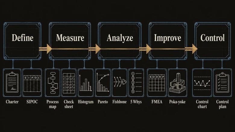
The main Six Sigma tools map to the DMAIC method: a project charter and SIPOC define the problem; process maps, check sheets, and histograms measure it; Pareto charts, fishbone (Ishikawa) diagrams, and the 5 Whys find the root cause; FMEA and poka-yoke prevent failures during improvement; and control charts (SPC) hold the gain. Seven or eight of these tools handle the large majority of factory defect problems.
Key Takeaways
- Six Sigma is a defect-reduction method; its “tools” are analysis techniques, not software, and each one plugs into a phase of DMAIC.
- About seven tools do most of the work on the floor: SIPOC, process map, check sheet, Pareto chart, fishbone diagram, 5 Whys, FMEA, and the control chart.
- Choose the tool by the DMAIC phase and the question you’re answering: priority (Pareto), root cause (fishbone and 5 Whys), risk (FMEA), stability (control chart).
- The target, six sigma, means 3.4 defects per million opportunities (99.99966% good). Most processes run near three sigma, roughly 66,800 defects per million and about 93% yield, without knowing it.
- Cost of poor quality runs 15% to 20% of sales at many manufacturers, which is why a handful of simple tools pay for themselves fast.
What are Six Sigma tools?
Six Sigma tools are the analytical and problem-solving techniques used to find, fix, and prevent process defects inside the Six Sigma method. They range from a one-page project charter to a statistically controlled chart, and most of them started life as simple factory quality tools long before “Six Sigma” had a name.
The classic core is the “seven basic quality tools,” sometimes called the seven QC tools or Ishikawa’s seven after Kaoru Ishikawa, who popularized them in postwar Japan: the cause-and-effect (fishbone) diagram, check sheet, control chart, histogram, Pareto chart, scatter diagram, and flowchart or stratification. Six Sigma keeps all seven and adds a handful more, mainly SIPOC, FMEA, the 5 Whys, and design of experiments.
The word “six sigma” is itself a number. It describes a process so capable that only 3.4 defects slip through per million chances to make one, which the American Society for Quality defines as 99.99966% good output. That is the destination. The tools are how you get there from wherever the process runs today.
And most processes run further back than their owners think. A process sitting at three sigma looks respectable on paper, yet it produces roughly 66,800 defects per million opportunities, or about 93% good, per the standard sigma conversion table. On a line running 100,000 parts a week that’s thousands of rejects. The gap between “feels fine” and “is capable” is exactly the gap these tools close.
DPMO = (Defects ÷ (Units × Opportunities per unit)) × 1,000,000DPMO is the yardstick behind the whole method, so it’s worth knowing the math. Ten defects across 2,000 units with two defect opportunities each works out to (10 ÷ 4,000) × 1,000,000, or 2,500 DPMO, which lands a shade under four sigma. That single number is what every tool downstream is trying to shrink. It also explains why quality gets budget: the cost of poor quality runs 15% to 20% of sales at many manufacturers, and in weaker plants it climbs higher.
Six Sigma tools attack variation and defects. Their close cousins, the Lean tools, attack waste and speed, and most factories now run both together as Lean Six Sigma. Where a fishbone diagram asks “why is this part out of spec,” a value stream map or the eight wastes of lean ask “why does this order take three weeks to move four days of actual work.” Same discipline, different target. This guide stays on the Six Sigma side, then draws the line clearly near the end.
The Six Sigma toolkit at a glance
Here are the Six Sigma tools a manufacturer actually reaches for, what each one does, and the moment to use it. Read the right-hand column first; it’s the part most tool lists skip.
| Tool | What it does | Use it when |
|---|---|---|
| Project charter | States the problem, scope, goal, and team on one page | You’re kicking off any improvement project and need alignment before work starts |
| SIPOC | Maps Suppliers, Inputs, Process, Outputs, Customers at a high level | You need to agree on where the process begins and ends before digging in |
| Process map / flowchart | Shows every step, decision, and handoff as the process really runs | You suspect defects or delays are hiding in a step nobody documents |
| Check sheet | A structured tally form for recording defects as they happen | You’re collecting defect data by type, shift, or location for the first time |
| Histogram | Shows the spread and shape of a measured dimension | You want to see whether a feature is centered and how much it varies |
| Pareto chart | Ranks problems so the vital few separate from the trivial many | You have defect data and must decide which problem to attack first |
| Fishbone (Ishikawa) | Sorts possible causes into categories, the six Ms | You know the defect but not the cause, and want every candidate on the wall |
| 5 Whys | Asks “why” in sequence until the root cause surfaces | The problem has one likely thread you can follow to its source |
| FMEA | Scores failure modes by severity, occurrence, and detection | You’re launching a new part or process and want to prevent failures, not react to them |
| Poka-yoke | Mistake-proofs a step so the error physically can’t occur | A recurring human error keeps slipping past inspection |
| Control chart (SPC) | Separates normal variation from a genuine process shift | You’ve fixed a process and need to hold it and catch drift early |
Two more belong on a Black Belt’s bench but not on most floors day to day: design of experiments (DOE), which tests several process settings at once to find the best combination, and regression, which quantifies how one variable drives another. Reach for them when the cause is a tangle of interacting inputs that brainstorming can’t unpick.
DMAIC: which tool at each phase
DMAIC — Define, Measure, Analyze, Improve, Control — is the backbone of Six Sigma, and each phase has its go-to tools. The value of the framework is sequence: it stops teams from jumping to a fix before they’ve measured the problem or found its cause, which is where most shop-floor “improvements” quietly fail. The table below is the whole method in one view.
| DMAIC phase | What you’re doing | Tools you reach for |
|---|---|---|
| Define | Pin down the problem, the customer requirement, scope, and goal | Project charter, SIPOC, voice of the customer (VOC), critical-to-quality (CTQ) tree |
| Measure | Set a reliable baseline: how big is the defect, measured how | Process map, check sheet, histogram, measurement system analysis, DPMO and sigma level |
| Analyze | Find the root cause with data, not opinion | Pareto chart, fishbone diagram, 5 Whys, scatter plot, regression, hypothesis tests |
| Improve | Test, pilot, and implement the fix | FMEA, poka-yoke, design of experiments, kaizen event |
| Control | Lock in the gain so it doesn’t slip back | Control chart (SPC), control plan, standard work |
The Measure phase is where projects live or die, because every later tool inherits its data. A Pareto chart built on guesswork points at the wrong defect; a fishbone drawn without measurement chases causes that don’t matter. This is why many plants pull Measure-phase data straight off the equipment through a manufacturing execution system that time-stamps counts and rejects automatically rather than trusting a clipboard that gets filled in at the end of the shift.
DMAIC has a sibling for brand-new designs, DMADV (Define, Measure, Analyze, Design, Verify), used when there’s no existing process to improve. And the Improve phase often runs as a focused burst rather than a slow grind: teams book a structured kaizen event to pilot and prove a change in days instead of months. The video below walks the five phases end to end if you want the method before the tools.
The root-cause tools: 5 Whys, fishbone, and Pareto
When a defect shows up, three tools do the detective work, and they run in a natural order: Pareto picks the problem worth solving, fishbone lists what could cause it, and the 5 Whys drives to the actual root. Used together they turn a vague “we have a quality problem” into a specific, fixable cause.
Pareto chart
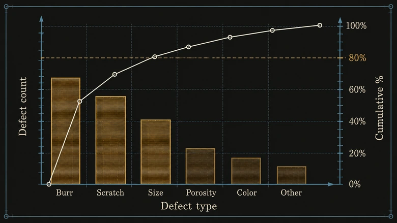
A Pareto chart ranks defect types by frequency or cost so the vital few stand out from the trivial many, built on the Pareto principle that roughly 80% of the problems come from about 20% of the causes. Sort your scrap by reason code, chart it, and the top two or three bars usually account for most of the loss. That’s where the project goes.
The chart matters because attention is the scarce resource on a factory floor. US metal fabricators average about 1.4% of sales in scrap and rework, and most shops undercount it because final inspection only catches visible defects, according to 2026 job-shop benchmark research. A team that spreads its effort evenly across every defect code fixes none of them. The same logic drives loss analysis in the OEE calculation, where a Pareto of the Six Big Losses tells you whether to chase changeovers, small stops, or slow cycles first.
Fishbone (Ishikawa) diagram
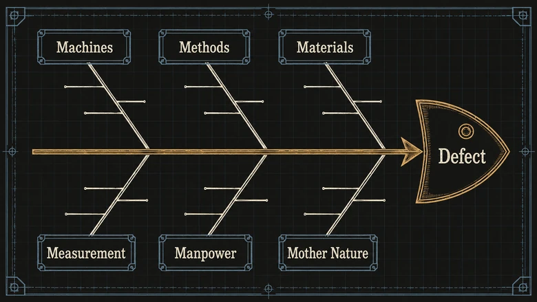
A fishbone diagram, also called an Ishikawa or cause-and-effect diagram, organizes every possible cause of a problem into categories drawn as bones off a central spine. In manufacturing the standard categories are the six Ms: Machines, Methods, Materials, Measurement, Manpower, and Mother Nature (environment). The team brainstorms causes under each, and the wall fills with candidates.
Its strength is breadth. When a defect could come from a dozen directions, the fishbone makes sure none get missed and stops the room from fixating on the first plausible cause. Its weakness is that it lists possibilities without proving any of them, so a fishbone is a starting map, not an answer.
The 5 Whys
The 5 Whys drills from a symptom to its root cause by asking “why” in sequence, each answer feeding the next question, until the chain reaches something you can actually change. A leaking seal, asked five times, might end not at the seal but at a purchasing spec that never defined the material. Fix the seal and it leaks again next month; fix the spec and it stops for good.
The 5 Whys works best on a single-thread problem with one dominant cause. Where the fishbone is wide, the 5 Whys is deep. That’s the core of the common 5 Whys versus fishbone question: use the fishbone when you have many candidate causes to surface, use the 5 Whys when you have one thread to follow down. They’re partners, not rivals.
PRO TIP
Run them back to back. Brainstorm causes on a fishbone first, circle the two or three bones the data supports, then take each one down with the 5 Whys. The fishbone keeps you honest about breadth; the 5 Whys gets you to something fixable.
Designing quality in: SIPOC, process mapping, and FMEA
Some Six Sigma tools earn their keep before defects happen, by mapping the process and ranking what could go wrong. These are the tools that separate a mature quality program from a firefighting one.
SIPOC and process mapping
SIPOC scopes a process at altitude by naming its Suppliers, Inputs, Process, Outputs, and Customers, which keeps a project from quietly expanding until it’s trying to fix the whole plant. Once the boundaries are set, a detailed process map or flowchart drops down to every step, decision, and handoff, exposing the rework loops and inspection stations that don’t appear on the official routing.
Both feed the Define and Measure phases, and both often reveal the customer requirement, the voice of the customer translated into a measurable critical-to-quality spec, that the shop was never actually built to hit. For a wider view that adds timing and inventory to the flow, teams graduate to value stream mapping, the Lean cousin of the process map.
FMEA
Failure mode and effects analysis (FMEA) scores every way a part or process could fail and ranks the risks so you prevent the worst ones first. Each failure mode gets three ratings, and their product is the risk priority number that sorts the list.
RPN = Severity × Occurrence × DetectionSeverity asks how bad the failure is, occurrence asks how often it happens, and detection asks how likely you are to catch it before it ships, each on a 1-to-10 scale. A high RPN means act now. FMEA is standard at launch in automotive and aerospace, where it’s often required, and its output feeds directly into two other tools: poka-yoke devices that mistake-proof the highest-risk steps, and the control plan that monitors them in production. Because an FMEA and its control plan are living documents, most plants keep them in a quality management system that versions and links them to nonconformances rather than in a spreadsheet that ages out.
Controlling the process: SPC and control charts
Control charts keep a fixed process fixed. They’re the signature tool of the Control phase, and they answer the one question inspection can’t: is this variation normal, or has something actually changed? A control chart plots a measurement over time against a center line and upper and lower control limits calculated from the process’s own history.
The key insight is that control limits are not specification limits. Spec limits come from the customer’s drawing; control limits come from the process’s real behavior. A point inside the control limits is common-cause variation, the ordinary noise you leave alone. A point outside them, or a non-random pattern, is special-cause variation, a signal that something specific changed and needs investigation before more bad parts get made. Statistical process control (SPC) is the discipline of reading those signals.
Capability then asks whether the controlled process is good enough for the spec, summarized in the Cpk index; a Cpk of 1.33 is the common minimum, meaning the process spread fits comfortably inside the tolerance. Control charts come in several types for different data, and choosing the right one matters enough that it gets its own treatment in our guide to SPC charts and when to use each type. Whichever chart you run, it only works if the data arrives in real time, which is why SPC increasingly lives on the shop-floor system rather than in an after-the-fact audit.
IMPORTANT
A control chart on a process you haven’t fixed just documents the chaos in real time. Charts belong in the Control phase, after Analyze and Improve have removed the special causes. Put SPC on an unstable process and you’ll spend every shift chasing signals instead of making parts.
Six Sigma vs Lean tools, and how to choose
Six Sigma tools attack variation and defects; Lean tools attack waste and speed. Most factories run both under the Lean Six Sigma banner, and the two toolkits overlap in the Analyze and Improve phases, but the question each answers is different. If the problem is that parts come out wrong, reach for Six Sigma tools. If the problem is that good parts take too long or cost too much to move, reach for Lean tools like value stream mapping, kaizen, and 5S.
Within Six Sigma, the tool is chosen by the phase and the question, not by preference. The short version of the decision:
- Use a Pareto chart when you have defect data and need to decide which problem to fight first.
- Use a fishbone plus 5 Whys when you know the defect but not its cause.
- Use FMEA when you’re launching something new and want to prevent failures rather than react to them.
- Use control charts and SPC when the process is capable and the job is now to keep it that way.
- Use a process map or SIPOC when nobody agrees on how the work actually flows.
The failure mode to avoid is tool-shopping: picking a technique because it’s familiar or impressive, then hunting for a problem to aim it at. That’s backwards, and it’s how plants end up with binders full of half-finished FMEAs and control charts nobody reads.
PRO TIP
Start every improvement with the question, then let DMAIC name the tool. “What’s our biggest defect?” is a Pareto. “Why does it happen?” is a fishbone and 5 Whys. “How do we stop it recurring?” is FMEA and a control plan. The question picks the tool; the tool never picks the question.
Frequently Asked Questions
Six Sigma tools are analysis and problem-solving techniques, not software, that find, fix, and prevent process defects. The working set is SIPOC, process mapping, the check sheet, the Pareto chart, the fishbone diagram, the 5 Whys, FMEA, and the control chart. Each maps to a phase of the DMAIC method, which sets the order you use them in.
The seven basic tools, from Kaoru Ishikawa, are the cause-and-effect (fishbone) diagram, check sheet, control chart, histogram, Pareto chart, scatter diagram, and flowchart (or stratification). Six Sigma inherited all seven and added SIPOC, FMEA, the 5 Whys, and design of experiments. The original seven still solve the majority of everyday quality problems.
DMAIC tools are the Six Sigma tools grouped by phase. Define uses the charter and SIPOC; Measure uses process maps, check sheets, and histograms; Analyze uses Pareto charts, fishbone diagrams, and the 5 Whys; Improve uses FMEA and poka-yoke; and Control uses control charts and a control plan. The phase you’re in tells you which tool to reach for.
Use the fishbone diagram when a defect could have many possible causes and you need them all on the wall before choosing. Use the 5 Whys when you have one likely thread to follow down to its root. They work best together: brainstorm causes on the fishbone, then drive the two or three most likely ones to their source with the 5 Whys.
Yes. Statistical process control, and the control charts it runs on, is the core tool of the DMAIC Control phase. SPC predates Six Sigma by decades, going back to Walter Shewhart in the 1920s, but Six Sigma adopted it wholesale to hold gains after a process is improved. Different data types need different chart types, covered in our dedicated SPC charts guide.