
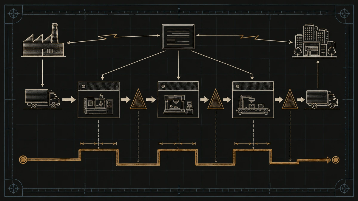
You can shave thirty seconds off a machine cycle, log the win on the shift report, and still watch the order take three weeks to reach the customer. That gap is the problem value stream mapping was built to solve. Most of the time a part spends inside a factory, it is not being cut, welded, or assembled. It sits in a queue, waits for a changeover, or moves to the next building. Value stream mapping is the lean technique that draws the whole door-to-door flow on one page, so that waiting, not just working, finally becomes visible.
A machine-level fix touches the thin slice of time that adds value. A value stream map shows the other 90-odd percent, the waiting and inventory between steps, where lead time and quality problems actually live. See that, and the individual cycle times you were tuning matter far less than you thought.
This guide covers what a value stream map is, the standard symbols, how to build a current-state and then a future-state map, and the timeline math (takt time, cycle time, and process cycle efficiency) that turns the picture into a number you can move. The angle throughout is flow and quality, because on most lines the two fail together.
Direct answer — What is value stream mapping?
Value stream mapping (VSM) is a lean method that diagrams every step in the material and information flow needed to bring a product from order to delivery. It records process cycle times, inventory, and waiting on a single page, then separates value-added time from total lead time to expose waste. Teams draw a current-state map of how the flow runs today, then a future-state map with a dated action plan. It is a flow diagnostic, not a detailed process flowchart.
Key Takeaways
- A value stream map draws the door-to-door flow of one product family on a single page, showing material flow, information flow, and the time between every step.
- Its core output is the timeline: value-added (processing) time versus total lead time. In many unimproved processes, value-added time is under 10% of the total.
- You always draw two maps: a current state reported from a walk of the floor, and a future state that designs out the waste, paced by takt time.
- The map exposes the eight wastes and, in a quality inspection value stream map, the rework loops and first-pass-yield losses that a plain flowchart hides.
- A current-state map with no future state and no dated action plan is wall art. The plan is the deliverable.
What is value stream mapping?
Value stream mapping is a lean technique that diagrams every step in the material and information flow required to move a product from customer order to delivery. A value stream is the full sequence of actions a product passes through on its way to the customer, both the ones that add value and the wasteful steps that lean works to remove. The map puts that sequence on one page and quantifies the time and inventory at each stage.
Unlike a process flowchart, which shows tasks, a value stream map records the time and inventory between tasks. That is the whole reason it exists: on most lines the waiting between steps dwarfs the working inside them, and only a tool built to show the waiting will surface it. The technique came out of the Toyota Production System, where it was called material and information flow analysis. Mike Rother and John Shook documented it for a wider audience in their 1999 workbook Learning to See, which made it the standard reference across lean manufacturing.
A value stream map has two halves that a flowchart lacks. The lower half tracks material flow, the physical movement of the product through each process. The upper half tracks information flow, the schedules and signals, usually set by the production scheduling that sequences each job, that tell each process what to make and when. A value stream runs smoothly only when those two agree, and the map is where a disagreement between them, a process building to a forecast while the customer pulls something else, shows up in plain sight.
Value stream mapping vs process mapping vs a flowchart
A value stream map, a process map, and a flowchart all diagram a process, but they answer different questions at different altitudes. Reaching for the wrong one is the fastest way to spend a week drawing something that does not help.
| Tool | What it shows | Use it when | Where it is weak |
|---|---|---|---|
| Value stream map | Door-to-door material and information flow, with time and inventory between steps | Lead time, WIP, or flow is the problem across many steps | Too coarse to optimize a single workstation |
| Process map | Every task, handoff, and decision inside one process | The bottleneck sits inside one process or department | Loses the end-to-end picture; carries no timeline |
| Flowchart | The sequence and decision logic of a workflow | Documenting steps, rules, or software logic | Ignores time, inventory, and information flow |
The decision is simple. Use a value stream map when lead time or inventory is the problem and you need the whole flow on one page. Use a process map when the trouble lives inside one process and you need task-level detail. Use a flowchart when you are documenting decision logic, not timing. The three stack: a value stream map finds the process worth fixing, and a process map then zooms into it.
Value stream map symbols
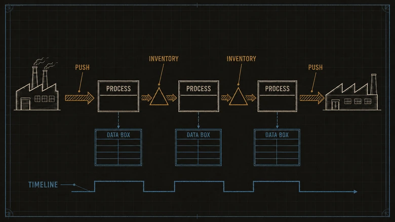
Value stream maps use a shared set of symbols so any lean practitioner can read a map they did not draw. The standard notation splits into three groups: process symbols on the middle band, material symbols on the lower band, and information symbols along the top. You do not need every symbol on every map, but the core set below appears on nearly all of them.
| Symbol | What it represents |
|---|---|
| Factory / customer icon | An outside plant. The supplier sits top-left, the customer top-right, framing the flow. |
| Process box | One process step or workstation with continuous internal flow. |
| Data box | The metrics under a process: cycle time, changeover time, uptime, operators, shifts. |
| Inventory triangle | WIP or finished stock waiting between steps, labelled with the count or days on hand. |
| Push arrow (striped) | Material pushed to the next step regardless of whether it is needed yet, the overproduction risk. |
| Supermarket and pull arrow | A controlled store the downstream step withdraws from, signalling the upstream step to replenish. |
| Kanban | A card or signal that authorizes making or moving a specific, limited quantity. |
| FIFO lane | A first-in, first-out sequence flow with a fixed capacity limit. |
| Truck shipment | External movement of goods to or from the plant, marked with its frequency. |
| Manual information (straight arrow) | Paper or verbal schedules and instructions. |
| Electronic information (zig-zag arrow) | Digital scheduling data such as EDI or an MRP release. |
| Production control box | The scheduling function, often MRP, that tells each process what to make. |
| Timeline / lead-time ladder | The stepped line along the bottom that sums value-added time against total lead time. |
| Kaizen burst | A starburst marking an improvement opportunity to be designed into the future state. |
The essential five are the process box, the data box, the inventory triangle (the WIP that inventory software counts by value but rarely frames as days of waiting), the push and pull arrows, and the timeline. Learn to read those and you can read most maps; the rest add precision as a value stream gets more complex.
IMPORTANT
Map the flow, not the org chart. A value stream crosses departments, and the worst waiting usually happens at the handoffs between them. Draw the flow end to end regardless of who owns each step, or the biggest problems will fall into the gaps between the boxes.
How to create a value stream map
To create a value stream map, pick one product family, walk its flow to draw the current state, then design a future state and an action plan. The steps below produce a paired current-state and future-state map for a single product family. Most teams run them as a focused event rather than spread over weeks, because a map drawn from memory across a month is a map of what people think happens, not what does.
Workflow · ≈ 2 days
How to create a value stream map: current state to future state
Map one product family end to end, quantify value-added time against total lead time, then design a leaner future state with a dated plan to reach it.
Pick one product family
Choose a single product or service family whose items share roughly 80% of their processing steps. Map one flow, never the whole plant at once.
Walk the flow and draw the current state
Go to the floor, follow the product from receiving to shipping, and sketch each process box in sequence. Draw right to left, starting from the customer, so demand pulls the map.
Fill in the data boxes
Under each process record cycle time, changeover time, uptime, operators, and shifts. Add an inventory triangle with a real count wherever product sits waiting between steps.
Add the material and information flow
Draw the customer and supplier, the push or pull arrows between steps, and the production-control box. Mark which schedules arrive electronically and which move on paper.
Build the timeline and calculate lead time
Draw the lead-time ladder: value-added process time on the lower step, waiting and inventory time on the upper step. Sum both to get total lead time and process cycle efficiency.
Design the future state and an action plan
Add takt time, place a kaizen burst wherever flow breaks, and draw the improved future-state map. Convert each burst into a dated, owned action so the map becomes a plan.
Two details separate a useful current state from a tidy fiction. Draw it from a walk of the floor, not from the ERP, because the system shows planned quantities while the floor shows the piles of real WIP the plan never admits to. And pull the numbers for the data boxes from wherever the line actually records them: on an instrumented line, cycle-time and uptime figures come straight off a manufacturing execution system that logs run time and counts from the machine, the same live feed that powers an OEE score, rather than from a stopwatch and a clipboard. That shift from clipboard to live data is a market in its own right: the digital lean manufacturing tooling market reached $34.66 billion in 2025 and is forecast to hit $79.94 billion by 2032.
PRO TIP
Draw the current state in pencil, on paper, on the floor. Software tempts you to tidy the map before you have seen the real flow, and a clean map hides the mess you came to find. Digitize the future state later, once the ugly truth is on paper.
Current state vs future state
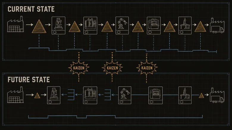
A value stream map is always drawn twice: a current-state map that records how the flow runs today, and a future-state map that designs how it should run. The current state is a photograph, reported from the floor. The future state is a blueprint, and it is where every hour of improvement actually lives. Skipping straight to solutions without an honest current state is how teams end up optimizing a step that was never the constraint.
| Current state map | Future state map | |
|---|---|---|
| Purpose | Record reality, waste included | Design a leaner flow |
| Question it answers | Where does the time actually go? | Where should the time go? |
| Source of data | A walk of the floor, real counts | Takt time and lean flow principles |
| Output | A baseline lead time and PCE | Kaizen bursts and a dated action plan |
Takt time sets the pace
The future state is anchored to takt time, the rate at which you must complete one unit to keep pace with customer demand. It is the metronome the whole value stream should play to, and it is calculated from demand, not from how fast a machine can run.
Takt Time = Available Production Time ÷ Customer DemandIf a line runs 450 available minutes a shift and the customer needs 90 units, takt time is five minutes: finish one good unit every five minutes and you match demand exactly, per the Lean Enterprise Institute definition. A future state designs each process, and the pull between them, to hold that beat. Where a process cannot keep takt, that is a kaizen burst, and turning each burst into a scoped, dated fix is the everyday work of a focused kaizen event.
The timeline: lead time, cycle time, and process cycle efficiency
The map’s payoff is the timeline drawn across the bottom. Cycle time is how long one process takes to make a part. Lead time is how long a part takes to cross the whole value stream, waiting included. The two are wildly different, and the difference is the waste. Process cycle efficiency puts a number on it.
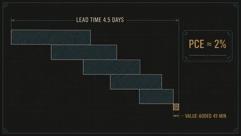
PCE = Value-Added Time ÷ Total Lead TimeThe result is usually humbling. In many unimproved processes, value-added time is a small fraction of lead time, often under 10%, while flows improved with lean methods typically push process cycle efficiency past 25%. Take a machined bracket: raw stock waits two days, machining runs 15 minutes, the part sits a day, a second operation runs 20 minutes, it waits another day, then final machining and inspection take 10 minutes before a half-day in finished goods. Value-added time totals 45 minutes against a lead time near 4.5 days, roughly 2,160 working minutes. That is a PCE around 2%. The future state does not touch those 45 value-added minutes; it attacks the four-plus days of waiting, and cutting the queues to a single day quadruples the efficiency without a single faster machine. Cycle time still matters where it gates takt, but on the timeline it is the waiting, not the working, that dominates the number and decides where the future state has to fight.
How value stream mapping exposes waste and improves quality
A value stream map earns its name by making waste measurable: every hour of inventory and waiting on the timeline is non-value-added time you can attack. Lean names eight wastes that drain a process, and a map surfaces most of them without any extra tooling. Inventory triangles are the inventory waste, sized in days. Push arrows are overproduction, building ahead of demand. Long distances between boxes are transport and motion. The upper step of the timeline is pure waiting.
Two wastes hide until you draw them. Excess inventory ties up cash and floor space that a stock report files as an asset rather than as days of waiting, and unplanned downtime shows up on the timeline as waiting nobody scheduled. The map does not fix either, but it forces both onto the same page as the lead time they inflate, which is the first time most teams see them as connected.
The quality inspection value stream map
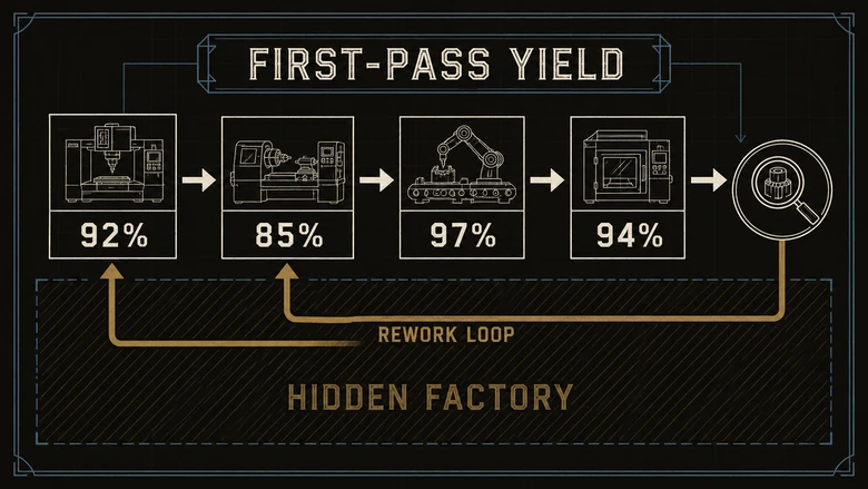
A quality inspection value stream map adds a quality lens to each data box: first-pass yield, the rework loop, and the extra lead time that defects create. It reveals the hidden factory, the shadow capacity a plant burns re-doing work that failed inspection. On a standard map a process looks fine; add a first-pass yield of 85% and a backward rework arrow, and the same process is quietly running at a loss.
This is close to Quality Filter Mapping, one of the recognized value stream mapping variants, and it matters because flow and quality fail together. A defect caught at final inspection has already consumed lead time, material, and machine hours at every upstream step, so it is far more expensive than the scrap number alone suggests. Mapping first-pass yield beside cycle time is where the defect data that lives in a quality management system that logs non-conformances at the source turns into a flow decision rather than a monthly scrap report. Each rework loop the map exposes becomes its own candidate for improvement, scoped and worked until the loop is gone.
A value stream map does not make a process faster. It makes the waiting visible, and visible waiting is the only kind a team ever removes.
Where value stream mapping goes wrong
The technique fails in predictable ways, and all of them are avoidable. Mapping the entire plant at once produces a wall-sized mural nobody acts on; the discipline of one product family per map exists for a reason. Drawing a beautiful current state with no future state and no dated plan turns the whole exercise into decoration, which is the single most common way VSM dies inside a company. And building the map from ERP data instead of a floor walk bakes in the same optimistic numbers you were trying to see past. A value stream map is worth the two days only if it ends in owned actions with dates on them.
Frequently Asked Questions
Value stream mapping is a lean method that diagrams every step in the material and information flow needed to bring a product from order to delivery. It records cycle times, inventory, and waiting on one page, then separates value-added time from total lead time to expose waste. Teams draw a current state, then a future state with an action plan.
The four steps are: determine the product family to map, draw the current-state map from a walk of the floor, design and draw the future-state map, and draft an action plan to reach the future state. In practice steps expand to include building the timeline and calculating lead time, but those four are the backbone of any VSM effort.
A current-state map records how the value stream runs today, reported from the floor with real cycle times, inventory counts, and lead time. A future-state map designs how it should run after waste is removed, paced by takt time and marked with kaizen bursts. The gap between the two, turned into a dated plan, is the improvement work.
Value stream maps use a shared notation: process boxes for steps, data boxes for their metrics, inventory triangles for waiting stock, push and pull arrows for how material moves, straight and zig-zag arrows for manual and electronic information, and a lead-time ladder along the bottom. A kaizen burst marks each improvement to design into the future state.
Value stream mapping is a lean tool, born in the Toyota Production System to attack flow and lead-time waste. It is also used inside Lean Six Sigma, often in the define or analyze phase of a DMAIC project, to find where a process loses time before statistical tools dig into a specific step. The map finds the problem; Six Sigma methods can then quantify its causes.